


Copywriting
I had a lot of fun with wordplay, especially the use of "Ya". It became a playful, flexible brand asset with potential in various contexts.
Most people know Yahoo, but don’t really know what it is anymore. "Ya" doesn’t solve that problem directly, but it gives the brand an ownable tone of voice, filled with personality and nostalgia.
Who's there?...
Ya!
Yahoo!
The “Yahoo Moment”
To activate curiosity in Gen Z/Alpha, we explored a campaign of misleads—ads that start with no clear context and end with a surprising Yahoo punchline.
The idea: Yahoo has always been here. It’s always been Ya!
Just like a catchy earworm—you start noticing it everywhere.


Yahoo idents
Inspired by Channel 4’s iconic idents, we imagined abstract visual interludes that slowly form the Yahoo logo. These short clips reinforce the campaign’s theme: It’s always been Yahoo. Ya got me!
This would increase brand recognition subtly but consistently over time
Yatopia
After creating claymation tests, we loved the idea of tiny, joyful "Yahoos" as characters.
Fun fact: In Gulliver’s Travels, "Yahoos" are actually a race of people. So we asked:
What if Yahoos (users) lived in a digital paradise?
A land where the internet is fun, informative, and free.
Thus, Yatopia was born.
To bring this world to life, we wrote a whimsical poem inspired by Dr. Seuss.
This tale helped frame the narrative tone for the entire campaign.

Dr.sues story
Have you ever wondered, “What’s Yahoo, you say?
A riddle? A puzzle? A word people say?”
“Is it ancient? Is it new?
Does it fly or stick like glue?”
It’s whispered in chatrooms, in whispers so low,
But what it all means, no one seems to know.
Some call it a sound, some think it’s a place,
A mythical land in a magical space.
Welcome to Yatopia, a land full of cheer,
Where Yahoos abound, and excitement is near.
They’re little and purple, with energy bright,
They burst with pure joy at the happiest sight.
Ya here, ya there, ya everywhere too,
Ya mum, ya see this? It’s all thanks to Yahoo!
A laugh, a connection, a moment so true,
Every spark of delight is a Yahoo debut!
The Yahoos don’t tire; they giggle and glow,
They tumble and bounce wherever you go.
When a Yahoo moment bursts in the air,
It spreads joy and wonder for all to share.
So next time you wonder, “What’s Yahoo, you say?”
It’s the land where joy blooms every moment, each day!
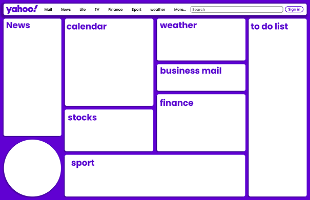
UI Design
With Yatopia in mind, I began the UX/UI phase by conducting a heuristic evaluation of Yahoo’s current site. The main issue? Inconsistency.
Yahoo’s many services: news, finance, email; felt disjointed and visually scattered.
My solution was to design modular widgets, each acting as a door into knowledge. Widgets gave flexibility across different services while maintaining visual consistency.

Conclusion
This project was a personal milestone. I gained valuable experience collaborating with other designers and strategists, and I deepened my understanding of campaign design and brand activation.
The campaign has been submitted to the 2025 D&AD Awards, with results pending.
More to come!