渥美

Identity Management™

We hope you felt in control.

Project Overview

Identity Management™ is a satirical digital experience critiquing how modern systems commodify humanity. Framed as a polished mega corporation, the project mimics corporate UX to sell morality, emotion, labor, and identity back to users through subscription tiers, emotional products, and AI tools. It is designed to feel disturbingly believable and quietly devastating.

Problem

As tech platforms, productivity tools, and wellness brands blur the line between person and product, we are sold solutions to problems created by the systems themselves. This project was driven by moral outrage at climate inaction, self-worth marketing, commodification of everything, and the growing normalisation of performance as identity.

Solution

Identity Management™ uses parody to expose this cultural absurdity. It recreates familiar corporate experiences: landing pages, pricing tiers, product cards, before breaking the fourth wall to offer real reflection and support. Beneath each surface joke is a deeper critique, and beyond each parody is a genuine call to action.

My Role

  • Concept development
  • Research and copywriting
  • UI design
  • Art direction
  • Visual asset creation
  • Brand system and tone definition

Provocation

More and more, I’m seeing how corporations shape the people around me. The erosion of self-worth. The obsession with things we’ll forget or throw away within weeks. Opinions that echo the messaging of companies that thrive on distraction. Climate denial, dressed as optimism, woven into the culture.

We’re being sold happiness and optimisation, but at the cost of identity, emotion, and purpose.

From the rise of AI tools and wellness startups to greenwashing and performance culture, the systems we live in are designed to extract and distract: not support. Identity Management was my response to this, created for the 2025 Creative Conscience Open Brief.

The Concept

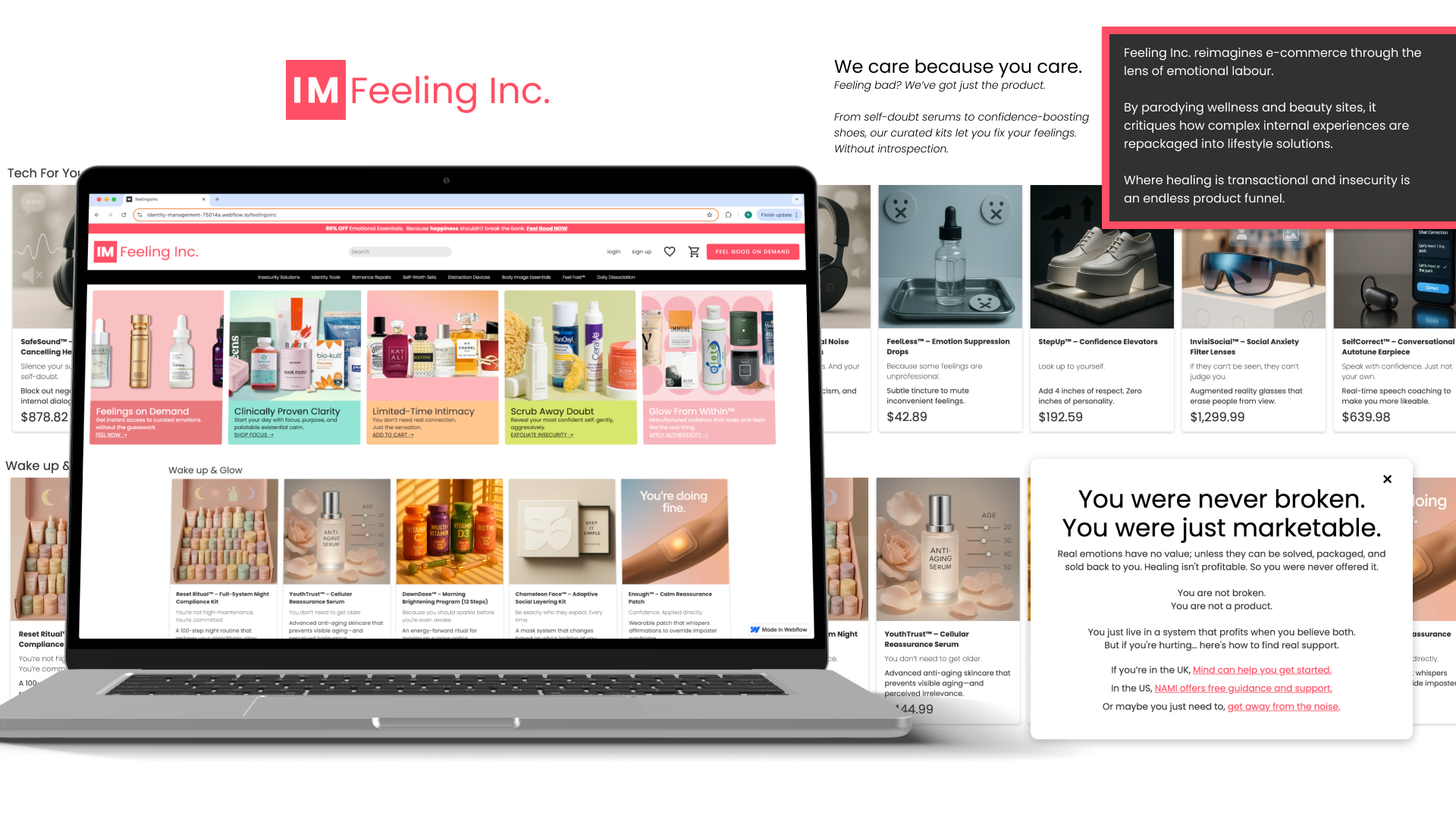
Identity Management imagines a world where every part of being human is optimised, packaged, and sold. It uses a fictional mega corporation to parody how real systems commodify morality, emotion, labour, and identity.

Inspired by cultural satire like Black Mirror’s “Fifteen Million Merits”, They Live, and the deadpan world building of Welcome to Night Vale, the project blends familiar corporate UX with unsettling messaging. Designed for both "swimmers" and "divers," it invites users to laugh at the surface, then sit with something deeper and more uncomfortable underneath.

Tone & Design Strategy

Corporate UX, Uncomfortably Familiar

Inspired by interfaces from Monday.com, Sephora, and Netflix.
Sleek. Sales-focused. Emotionally hollow.
I mimicked these to create something that feels real...until it doesn't.

AI-Generated Interfaces & Products

Tools and products were generated using AI to reinforce the artificial polish of the world.
If it looks like it was made by no one, that’s the point.

Subtle Fourth-Wall Breaks

Each page ends with a tonal shift.
Modals and disclaimers quietly break character to offer real support or reflection.

Visual Tone & Consistency

Poppins font, clean grids, and sterile palettes.
A corporate system built to feel efficient, but never human.

Outcomes

Each page ends where the performance breaks.

The user walks away with discomfort, maybe a laugh, and then something real;
 a resource, a redirection, or a reminder that the joke is over.

The satire exposes the systems.
 The final clicks point to what they’re distracting us from.

The site: Identity Management

Reflection

Researching reference sites made one thing clear. Tone of voice is a powerful tool for manipulation. Across industries, the buzzwords changed, but the strategy was the same: sell people back their own emotions.

What surprised me most during testing was how personally people responded to different pages. Everyone connected to a different brand, and each reaction revealed something quietly human. It reminded me that satire lands best when it reflects something real.

If I could go further, I would expand the interaction design. I wanted every button and link to respond directly to user engagement. The current CTAs work, but a more responsive layer would sharpen the experience.

The hardest part was restraint. This could have easily become a manifesto, but I did not want users to walk away feeling lectured. I wanted them to reflect. Still, the anger was hard to suppress. It fuelled the work.

The project intentionally leaned into AI. I used it to generate fake products, brand assets, and corporate sounding copy. A few UI mockups were AI generated, but the core site design, structure, and layout were entirely my own, built in Webflow and styled to mimic the very platforms I was critiquing. That tension added a meta layer to the work: using the tools I was questioning to build the thing that questions them.

Let’s make the internet a little more fun!

Get in touch via email or fill out the form.
robertatsumi.design@gmail.com
Thank you! Your submission has been received!
Oops! Something went wrong while submitting the form.