Outcomes
The Atmo Sphere
A seamless blend of ambient light and procedural sound.
The Atmo App
Studio for creating, controlling and sharing atmospheres.
Community integration
Ability to share and discover user generated ambiances.
Design/ campaign deliverables
Campaign assets made by design partner.


Research and Discovery
Our environments profoundly shape our emotions and health, especially through sensory channels like light and sound. I focused on three key research areas to guide the early concept for Atmo:
Human-Centric Lighting (HCL):
Studied how natural light patterns regulate circadian rhythms, alertness, and relaxation. Designed lighting behaviour to mimic these shifts; cooler tones during the day to support focus, warmer tones at night to aid rest.
Sound & Frequency Response:
Studied how natural light patterns regulate circadian rhythms, alertness, and relaxation. Designed lighting behaviour to mimic these shifts; cooler tones during the day to support focus, warmer tones at night to aid rest.
Synthetic, Playful Interaction:
Explored the mental health benefits of multi-sensory engagement and non-goal-oriented play. Interaction with the sphere (tapping, holding, swinging) was designed to encourage sensory grounding and emotional well-being.
Key Insight:
Calm is not passive. It is created through active, intuitive interaction with our environment.
Concept Development
Concept Board
Initial Concept board to help frame project.

UI Mood board
Inspiration for how UI could look, feel, interact.

Visual Mood board (Design)
Visual exploration by designer Fred Foulkes.


UX Design Process
User flow of the editor

Early UI
Initial Lofi/midfi wireframes of Editor.


Visual Design
We wanted a way to show a “preview” of the atmospheres. We Initially had vectorised landscapes but switched to circles as the visualised representation of a sphere.
For obvious reasons.

Advertising assets
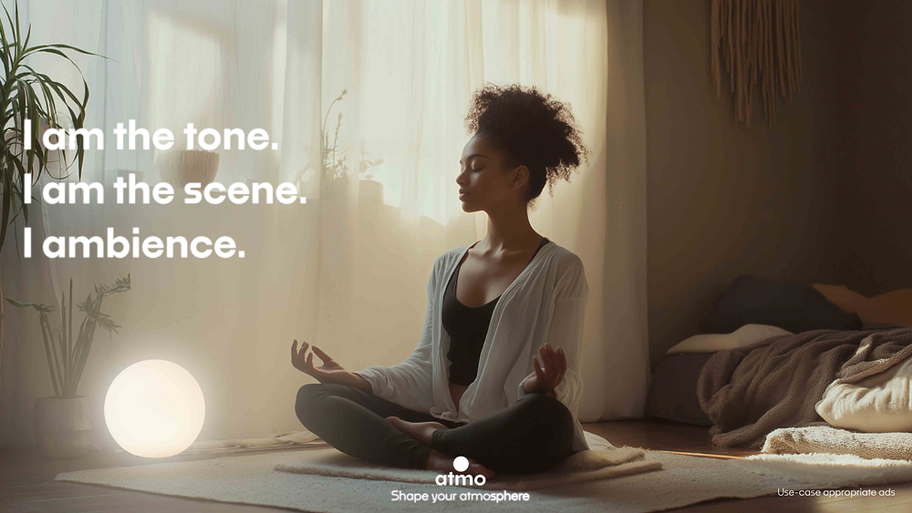
Early in the project, I created personas to explore different use cases for Atmo. While I focused on UX, my design partner rendered this advertisement, which captures the essence of the Atmo Sphere effectively. Together with the Sphere visualizers, it helped frame the product's emotional value and directly informed the refinement of the new UI.


Refinement
Aligning old UI to new visual language.


Reflection
We began with the ambition to create a full product, but as the scope became clearer, the focus shifted to designing the ecosystem around it. If I were to develop this project further, the next step would be to build a functional version of Atmo, alongside physical packaging and real world interactions.
The UI was guided more by visual clarity than functional depth, given the briefs focus on storytelling over UX. The goal was to communicate the product’s intent at a glance through clean, expressive design. Many features remain conceptual, but I see future potential in developing them into a fully realised interface.